Pages

Saturday, 31 January 2015

Professional Organisation - Design Council

The Design Council is an independent charity, established by Winston Churchill in 1944. They work with a variety of people. By woking with professional designers they aim to tackle major issues such as community cohesion and health issues. They give people practical tools, professional advice and knowledge that can help improve their business.

They have a collection of helpful resources on their website for many kinds of designers, from landscape designers to product designers.

At first, their website is a little hard to figure out who they are and what they do, but after a while of browsing you soon get the idea. One part that really interested me is their projects tab. The style they are in is somewhat like the style I wish to work in; clean, simple and minimalistic yet still effective.

You can take a look yourself here if you wish.


Sunday, 18 January 2015

A Nose for Type - Eye Magazine Autumn 2010

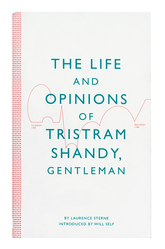
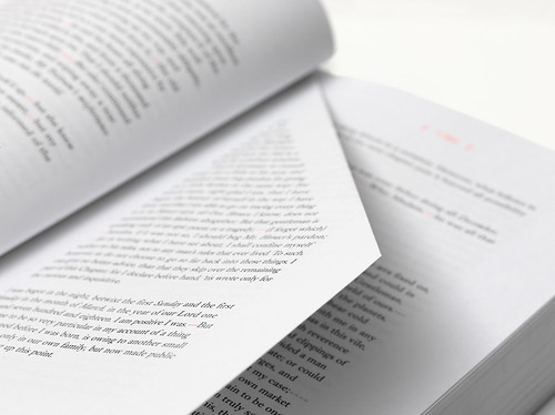
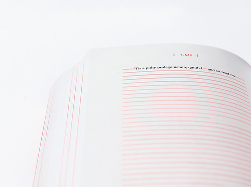
This article from eye magazine features a fresh, new company that have revamped an old book cover (originally printed in nine pocket size volumes between 1759-67), giving it a new lease of life. The article begins by describing how they've refreshed the old book, by adding 'garnish fluorescent ink' on what is described as 'white stock'. 
The article then goes on to talk about how the new designers got to know the book to begin with, and how different they feel about it now that it has been redesigned. They state that they try to make the visual aspects part of the text itself, rather than illustrations. Some of the new and improved features include folded pages, perforated pages to show the missing paragraph, and spot varnish. 


To me, this article shows that a little bit of a redesign can't hurt, and sometimes it improves things drastically, almost making it seem like a completely new book with all the old aspects. I'm quite interested in redesigning book covers, as well as creating them, as its all about the saying 'you shouldn't judge a book by its cover' even though we all do and we can't help it. If I'm walking in a book store and I see a really interesting cover, I go to that first, rather than the book I was originally looking for. I feel as though it's the key to not only getting the reader to notice the book, but also to giving first impressions and maybe kick-starting their imagination when reading the book. 

Monday, 12 January 2015

Eye Magazine

Eye Magazine describes itself as 'the world's most beautiful and collectable graphic design journal'. This is published 4 times a year for students, professional designers, and anyone who has a general interest in design and culture. The magazine is available from many arts bookshops, but is also available online at the Eye Shop where subscriptions can be purchases, as well as older issues.

Eye magazine also have a blog online hat you can follow, where they publish reviews and articles about books, designers, and photographers. This is a great blog to refer to when you're needing a bit of influence, or just want to expire further into the creative world. 
On their website, they also have a section called 'Education', which has a list of links to useful university websites and you could say it even suggests the best arts universities and institutes to study at.

This magazine has always been an influence during my studies, on my previous course there was a box of these at the side of the room that we could always refer to if we needed some inspiration or even some research. Now if I'd like to seed them, I'd have to subscribe for a year at £34.00 (student price) or buy older copies from auction sites where they'll be cheaper for students, or visit the library where I study as they have recent issues. The problem with this is that you do have limited access, and they aren't your own for you to use.

The site also offers a 'try before you buy' feature, which links you to a video featuring the latest copy of the magazine, allowing you to look through briefly online so you can decide whether to purchase the magazine. I find this really handy, as sometimes when purchasing something expensive, you can feel as though you've wasted your money as you don't find the magazine useful or interesting.


Saturday, 13 December 2014

Ivan Hoo

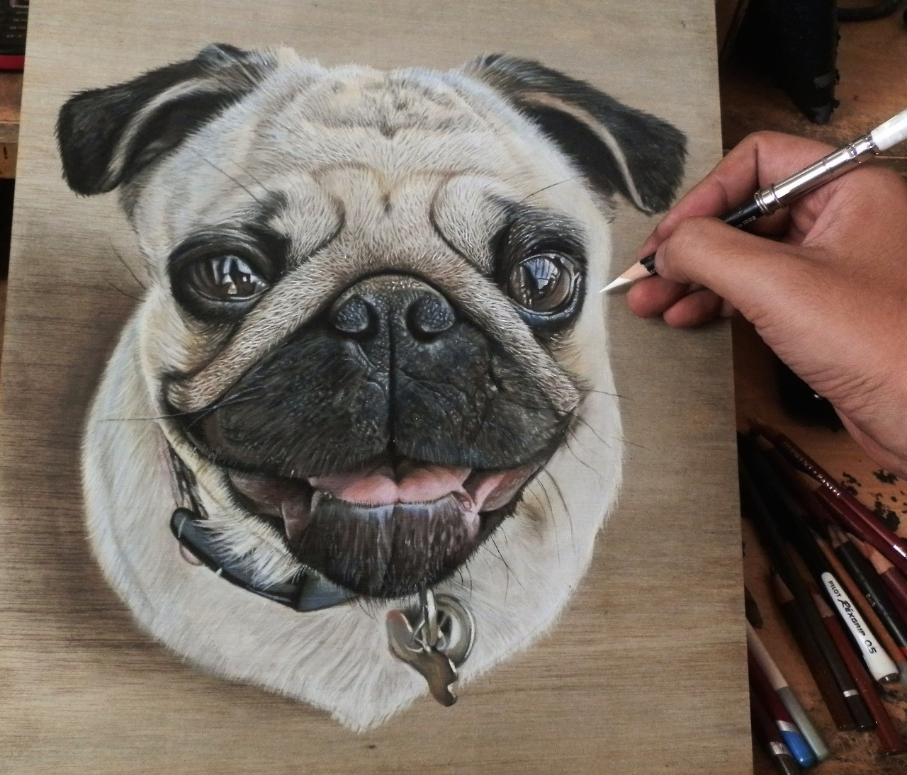
Well, who is Ivan Hoo? He is a visual artist and art instructor from Singapore. As a self taught artist, he has been constantly drawing since a very young age. He focuses on hyper-realistic drawings and still life drawings of everyday things, and prefers to work with dry mediums such as pastel but would like to do more paintings in the future. 

Recently, he has been working on wood with pastel. Yes, wood. A medium from which paper is derived from, yet has a completely different texture. Below are some of his works:


One thing that absolutely baffles me about his work is that once the drawing is complete, the grain of the wood disappears beneath the image. I always thought that would have an effect on the drawing, making it more difficult to produce but Hoo makes it look as easy as pie.After a closer observation of his drawings, he appears to create a base layer of colour first, from which he builds more solid colour blocks before adding in the finer colour and detail. His artwork is rule astonishing and at a first glance, I actually thought they were photographs. 

Although I work in a completely different medium, I could still reflect his way of working by working up the base layers and adding the detail, which I definitely need to start doing as I just dive straight in, head for the details and then get frustrated when it doesn't work as half of it is complete and the other isn't.

What have I learnt from this artist? Don't believe everything you see at first glance.

Wednesday, 10 December 2014

The Man Who Punched a £7.8m Painting

Whilst watching the recent news, it was brought to my attention that a man who was visiting a gallery, thought it would be a great idea to punch a Monet painting that was worth an estimated £8million. After further research online, I discovered that the man was actually jailed for his wrong-doing, and I also found out how they restored the damaged painting.

The Daily Mail (Mail Online) states that Andrew Shannon, aged 49, entered the gallery back in 2012 in a calm manner, and claims that he 'collapsed' onto the painting due to a heart condition, although witness say that he clearly used his fist. He has been jailed for six years out of a maximum of ten and has been banned from entering all galleries.
What truly shocked me was that art was protected in such a way that if damaged, you could be sent to jail for it.

After two years, the painting has finally been able to be repaired by finely sewing the tears back together with the same material that the painting was on, and then after collecting all the tiny, microscopic fragments that fell from the painting when hit, they carefully placed those back onto the painting after hours of research into the painting. This site explains how.

This gives artists a sense of security in a way, to know that their artwork will always be protected when on display, and to know that whoever damages it could get sent to jail for such a crime. How has it affected me? Well, I know that I won't be going round punching paintings anytime soon! (Not that I would anyway…)

Sunday, 30 November 2014

blink.

Ignorance is bliss.

This artwork is about how much information we read online each day, but how most of it just disappears before as our eyes, and we ignore it. It also reflects how sometimes the most important information doesn't affect us, where as just 20 years ago it would have been a different story.

With modern day technology, we are exposed to almost everything online, including things of horror, macabre and just things that we shouldn't be seeing often. This includes video games, where the graphics are becoming more and more life-like, almost making us feel as though we're there, right in the middle of a battlefield shooting someone down. We see them fall down, but it has no impact on us as it's what we've gotten used to as we grew up.
Me, personally, was allowed to play violent video games when I was younger, but I haven't realised how much this has impacted me, as well as seeing horrific images in the news as technology has got more advanced. I grew up seeing these types of things, so I thought nothing to it until I saw this. The modern day people have got used to so many horrifying statistics, images and events that they have almost become normal to us. They don't shock us anymore, when really it should do, as we now care much less than before. 

The way the piece of artwork is designed it rather unique, it lives up to the message on the paper, and it reflects what we see in day to day life but ignore it. By showing these shocking facts in this way, it really opens up our eyes and minds as to what we're missing, and makes me wonder 'how much are we reading but ignoring in day to day life?'. I believe the aim of this project is to shock the viewers, into realising what has become of this world and how little people know about whats really happening out there in different countries. 

Saturday, 15 November 2014

CargoCollective

Earlier this week, a friend of mine who is off at university shared a link with me which led to a collection of beautifully designed posters by the artists/art director Shauna Mae. These are minimalistic designs with few colours, but to me this makes them even more appealing. Take a look yourself here

I can relate to this artist is that they don't have a set style, which is what I struggle with. I cannot seem to stick to a certain style as I want to explore many, and not just be stuck doing the same style all the time. Although the styles are different, the majority of them relate to one another as they have a simple shape and line style, with the use of empty/negative space helping draw attention to the designs. An element of Mae's work that catches my eye is the colour. They don't stick to a colour scheme, but some of the colours they use within each artwork blend together subtly, where-as others contrast strong against each other, giving the artwork a certain pop that just makes you look. 

After further research into the website cargocollective.com, I have discovered that it is a personal publishing platform for various creative areas, from photography to digital. It is a great way of finding new and contemporary artists, or even students to reflect from and be inspired by. However, I don't think I'd use this site to search for artists that much, as it doesn't feature that many graphic designers, which is my specialism.

"As the founders of Cargo we have our own respective backgrounds as artists, designers and filmmakers and share a deep commitment to the creative culture we support. "