Pages

Tuesday, 27 May 2014

Eye Magazine Vol.11 Spring 2002 - Colour Overprinting

Whilst reading through this magazine, I came across an article about a feature in Adobe Illustrator that isn't the most obvious feature of the software. This is the overprinting feature. Hidden away in the Attributes palette is the Overprint Fill setting, this allows the colours that are layer on top of each other to 'blend' as such. For example, when the overprint fill is turned off in the palette, a blue circle placed on top of a yellow circle would block out all the yellow from the circle behind. Where-as with the overprint fill on, it would the colour produced from overlaying a blue on top of a yellow would be a green circle, as the two colours have been merged together. 
When this setting is on, when being send to print, the printer adapts the way it prints to these settings. Instead of the printer printing the colours separately, leaving space for complimentary colours as such, the printer literally overprints the colours to get the overprint colour effect. Below is a photograph of the overprint design featured in the magazine:

This shows the mixing of the four colours of CMYK (Cyan, Magenta, Yellow & Black), the base colours used when printing.
This printing/designing technique only came around in the 1940s when designers have taken to this technique as a device of image construction, around the time when the Swiss International Style started to become known and widely used. Adobe Illustrator is similar to a digital version of old printing techniques, example: The overprinting technique is very similar to the manual printing process, with inks, rollers and different materials like lino. If you were to use this traditional printing technique and to print blue over yellow, or yellow over blue, you would get two different shades of green, as the pigment in the inks would have mixed together. Back in the nineteenth century, the colour mixes were practiced and perfected as overprinting was an important process back then as it meant less colour plates to print, which meant less ink and time spent printing, which then led to lowering the costs of printing.
Below is another design featured in the overprinting article, as an example of how a professional designer (Bradbury Thompson) exploited colour overprinting for production purposes: 

In this design, along with the overprinting technique being used, transparency has also been adjusted so that the image underneath shows through a little more. I really like this design as it's a complete mix, showing a detailed drawing with digital elements. 
During my final major project, I did experiment with overprinting block colour shapes to try and create a bird. I quite liked this process, as it reminds me of the Swiss International Style, which I'm really fond of. I think I will continue to use this technique more prominently within my work in the future.

References: Eye No. 43 Vol.11 Spring 2002, Pages 36 - 45


Thursday, 27 February 2014

~

Here on my blog you will find posts on:

Alexis Winter
Satchel & Sage
Chesterfield College Arts Festival 2013
Chesterfield College Fashion Show 2013
Marian Bantjes
The Holocaust (propaganda)
Art Deco Artists
Counterfeit Goods
Photomontage
Evan Hecox
& many more that will be added following on from this post!

Sunday, 16 February 2014

Alexis Winter

Whilst browsing the web the other day, I came across the blog of an artist named Alexis Winter, who is based in Melbourne, Australia. She is currently studying a masters in communication design and loves making things from different mediums.

On her blog, she says that when creating her illustrations, she starts by sketching and adding a small amount of water colour for the base. She then draws the line work by hand using a 0.7mm black pen and then scans it onto the computer to touch up the colouring in photoshop. 

Here is some of her work:

'Love Birds'
In this piece, I really like how each section of the birds feathers is a solid colour, but each one is a different shade. Another thing I like is how the branches are bend into a heart shape, mimicking this weeks valentines theme.


I really like this piece, the colours blend really well together through the lines, unlike the one above where each section is a solid colour. Another thing I like is how you don't see the the texture of the background in the illustration, because it's hidden by the wonders of photoshop - it gives it a really interesting contrast!


Recently, she has taken part in a self portrait challenge, where each week she posts an illustration of herself, describing her work. This is a really interesting challenge and i'd like t take part in it, but unfortunately I wouldn't have time to create such interesting pieces. Alexis also does some paper embroidery, by sewing typography. Here are a few pieces:

I really like this kind of thing and I may take up on it when I have a bit of spare time - it could help me develop new skills and it would also expand my range of work for my portfolio.


Here are a few links to view her work:
Blog
Instagram
Online Store


Monday, 3 February 2014

Satchel & Sage

Whilst at college today, my friend suggested that I check out this small company/business online who have a love of design, illustration and typography. They produce 'colourfully designed printed goods and textiles that incorporate hand-drawn typography, playful illustrations, and sophisticated patterns.' This, is Satchel & Sage.

I've become quite fond of this company, as their word is cute, fresh and hand-made.
Here are a few of my favourite items of theirs:

On the site, it states that these are screen prints on wood. I really like how they look, they appear to be very natural and subtle. I'd love to have a go at screen printing onto wood myself, but I'm unsure of how the process works. I feel that printing them on wood instead of another surface helps to life the print from the background, but it also brings them together as they both have a theme of nature.                         

They also sell many different products such as gift tags greetings cards, cushions, notebooks, post cards, frames prints and calendars. There are a series of similar prints on the site which I'd love to own -  they're just lovely and simple, basic colours and not too 'busy' as some would say. They also feature a trio of words that could be considered as 'motivational' or 'inspirational', linking them together in the middle like a venn diagram. I also like how a selection of shapes and different typefaces have been merged together in an interesting way to create these pieces, I'd love to know where the companies ideas come from.

Tuesday, 17 December 2013

Russian Constructivism

Russian Constructivism


Russian Constructivism was a movement created by the Russian avant-garde, which began in 1913 that quickly reached the rest of the continent and remained active until the 1940s.  The movement was influenced by another pervious art movement called Cubism, which was the very first style of abstract art, letting other artists see work in a whole new perspective. The name was generated from Russian artists whose work was in a constructed order or manner. The name referred to a group of artists who wanted to move on from the autonomous art object, extending the definition of abstract art to include practical design work. The development of this movement was fed by the Revolution of 1917, which made artists want to find and create a new visual environment which included the social needs and values of the new Communist order. 


The movement often has geometric and minimal themes, which are experimental and rarely emotional, but also has a devotion to modernity. Subjective and individualistic forms weren’t really suited to the style, where as objective forms that has a universal meaning were more suited to the movement. It was also characterised by its precision, clear formal order, impersonality, simplicity and contemporary materials used. One common factor within this movement is the use of stencil-like sans serif typefaces, which is featured on many pieces of work. he artwork that featured in this movement was  usually art that was broken down into its most basic elements such as shapes. The style was rather orderly, which was crated by the use of new media. The need for order was needed at the time as the movement happened just after WWI, where the there was still a need for unity, peace and understanding. The artists still worked in the traditional artistic media of painting and sculpting as well as experimenting with photography such as photomontage.


The materials that were involved in this movement, such as industrial materials like glass; steel, and plastic were still used by other artists that weren’t big influences in the movement. A range of different artists such as painters, sculptors and even photographers used these materials in their work. The Russian Constructivist era was brought to a sudden end with the death of a Communist leader in Stalin’s dictatorial rule. The Stalinists called an end to the movement as they considered it to be too rarefied to serve as an effective form of state propaganda. The Constructivist designers who refused to co-operate retired from their public life, and fled the country or got paid visit from the police in the early hours of the night.
Personally, I really like this art movement as it’s very unique compared to the others, it has a broader range of materials and interesting compositions. I also like the combination of photographs from different angles and different colours, aswell as the use of angular shapes at odd angles, which make it stand out and draw your attention to it. I also like how coloured paper with different visual textures are used, it gives a really strong mixed media effect, along with the main colour theme of red, allowing you to easily recognise a piece of work from the era.


Tom Purvis & Commercial Art


Tom Purvis
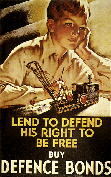
Tom Purvis was born in Bristol in June 1888 and was the son of sailor and marine artist, who was professionally known as T G Purvis. He studied at Camberwell School of Art and for six years he worked at the advertising firm of Mather and Crowther before he took the decision to become a freelance designer. During his time as a freelance designer, he developed a bold style, where the shapes were two-dimensional large blocks of bright colour, that didn’t have much detail in them. He then took a break from freelance designing to fight in the First World War in the Artists Rifles regiment, which was raised in London in 1859 as a volunteer light infantry unit.


Purvis worked for the London and North Eastern Railway (LNER) from 1923 to 1945, where he was allowed considerable freedom in his designs. During his time at LNER, he produced over 100 posters, which worked out at about 5 or 6 pet year or one every two months. He had a very high status within LNER’s advertising department, as he was one of the major designers involved in the most recognisable LNER style – bold and graphic. His posters for the LNER didn’t include methods of transport, but instead he focused on portraying the resorts and holiday destinations that the trains travelled to ad the leisure pursuits that could be enjoyed there. Many of his posters portrayed women in bathing costumes with bare arms and legs, which was unheard of and very risky in 1930’s Britain. When painting these scenes, Purvis used warm colours to give it a Mediterranean feel, even though these were only British eastern coastlines. This also emphasised that the east coast was the ‘drier’ side of Britain and the top place to visit the seaside. As well as creating individual posters, Purvis also designed two sets of six poster or the LNER that could either be displayed separately, or joined together to create a single overall image. Purvis also designed some posters for the Gentlemans’ outfitters Austin Reed and also for the 1932 British Industries Fair. In 1930 he joined a group called the Society of Industrial Artists, which put pressure on the industry to improve standards of training for graphic designers and to provide a wider range of employment for them. 
Tom Purvis is somebody who I take influence from as I really like Purvis’ work as it shows a lot, just through a few simple coloured shapes - how so much can be displayed through so little I’m really fond of how he shows scenes at the seaside, focusing on the amount of people there or showing how much fun they’re having. 


Commercial Art
Art that is created for commercial purposes, primarily advertising, has the name commercial art. This term has become increasingly older over the years, as new contemporary terms such as advertising art and graphic design are being used instead, even though graphic design is thought of to be more digital based than hand made. Commercial art was traditionally things like designing books, product branding and advertising of those products, creating signs and posters and other displays that promote sales or services. To be a commercial artist, the artist needs to have the ability to mix together information and knowledge of fine arts, visualisation and different media, as communication is the most important part of this field. They also need skills in free-hand drawing, painting and experience using graphic design and editing software, with a basic knowledge of the principles of advertising. The artists work in a variety of situations, doing many different things in the world of art such as illustration and animation when computers came around.  The work the artists create is usually made for mass exposure, production and distribution, as it was a main way for businesses to promote their products and services.


Friday, 13 December 2013

Quick Overview

I havent posted in a while as i've been really focused on my college work and finding the correct progression route for me. I've decided to continue in the graphic design route and to do a HND (higher national diploma) at Chesterfield College. I've decided to do this course as I dont feel that I am yet ready for university and I feel that the HND will ready prepare me for that, if I do decide to go. 

Whilst I havent been posting i've uploaded a report of mine on the history of typography and my digital portfolio to Issuu, both can be found on the following link: Issuu - Sophie Maclean