Pages

Tuesday, 17 December 2013

Russian Constructivism

Russian Constructivism


Russian Constructivism was a movement created by the Russian avant-garde, which began in 1913 that quickly reached the rest of the continent and remained active until the 1940s.  The movement was influenced by another pervious art movement called Cubism, which was the very first style of abstract art, letting other artists see work in a whole new perspective. The name was generated from Russian artists whose work was in a constructed order or manner. The name referred to a group of artists who wanted to move on from the autonomous art object, extending the definition of abstract art to include practical design work. The development of this movement was fed by the Revolution of 1917, which made artists want to find and create a new visual environment which included the social needs and values of the new Communist order. 


The movement often has geometric and minimal themes, which are experimental and rarely emotional, but also has a devotion to modernity. Subjective and individualistic forms weren’t really suited to the style, where as objective forms that has a universal meaning were more suited to the movement. It was also characterised by its precision, clear formal order, impersonality, simplicity and contemporary materials used. One common factor within this movement is the use of stencil-like sans serif typefaces, which is featured on many pieces of work. he artwork that featured in this movement was  usually art that was broken down into its most basic elements such as shapes. The style was rather orderly, which was crated by the use of new media. The need for order was needed at the time as the movement happened just after WWI, where the there was still a need for unity, peace and understanding. The artists still worked in the traditional artistic media of painting and sculpting as well as experimenting with photography such as photomontage.


The materials that were involved in this movement, such as industrial materials like glass; steel, and plastic were still used by other artists that weren’t big influences in the movement. A range of different artists such as painters, sculptors and even photographers used these materials in their work. The Russian Constructivist era was brought to a sudden end with the death of a Communist leader in Stalin’s dictatorial rule. The Stalinists called an end to the movement as they considered it to be too rarefied to serve as an effective form of state propaganda. The Constructivist designers who refused to co-operate retired from their public life, and fled the country or got paid visit from the police in the early hours of the night.
Personally, I really like this art movement as it’s very unique compared to the others, it has a broader range of materials and interesting compositions. I also like the combination of photographs from different angles and different colours, aswell as the use of angular shapes at odd angles, which make it stand out and draw your attention to it. I also like how coloured paper with different visual textures are used, it gives a really strong mixed media effect, along with the main colour theme of red, allowing you to easily recognise a piece of work from the era.


Tom Purvis & Commercial Art


Tom Purvis
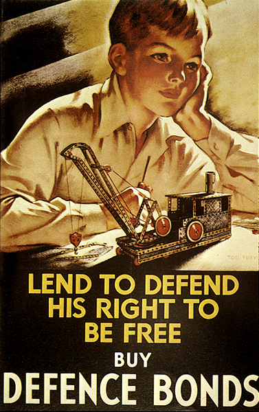
Tom Purvis was born in Bristol in June 1888 and was the son of sailor and marine artist, who was professionally known as T G Purvis. He studied at Camberwell School of Art and for six years he worked at the advertising firm of Mather and Crowther before he took the decision to become a freelance designer. During his time as a freelance designer, he developed a bold style, where the shapes were two-dimensional large blocks of bright colour, that didn’t have much detail in them. He then took a break from freelance designing to fight in the First World War in the Artists Rifles regiment, which was raised in London in 1859 as a volunteer light infantry unit.


Purvis worked for the London and North Eastern Railway (LNER) from 1923 to 1945, where he was allowed considerable freedom in his designs. During his time at LNER, he produced over 100 posters, which worked out at about 5 or 6 pet year or one every two months. He had a very high status within LNER’s advertising department, as he was one of the major designers involved in the most recognisable LNER style – bold and graphic. His posters for the LNER didn’t include methods of transport, but instead he focused on portraying the resorts and holiday destinations that the trains travelled to ad the leisure pursuits that could be enjoyed there. Many of his posters portrayed women in bathing costumes with bare arms and legs, which was unheard of and very risky in 1930’s Britain. When painting these scenes, Purvis used warm colours to give it a Mediterranean feel, even though these were only British eastern coastlines. This also emphasised that the east coast was the ‘drier’ side of Britain and the top place to visit the seaside. As well as creating individual posters, Purvis also designed two sets of six poster or the LNER that could either be displayed separately, or joined together to create a single overall image. Purvis also designed some posters for the Gentlemans’ outfitters Austin Reed and also for the 1932 British Industries Fair. In 1930 he joined a group called the Society of Industrial Artists, which put pressure on the industry to improve standards of training for graphic designers and to provide a wider range of employment for them. 
Tom Purvis is somebody who I take influence from as I really like Purvis’ work as it shows a lot, just through a few simple coloured shapes - how so much can be displayed through so little I’m really fond of how he shows scenes at the seaside, focusing on the amount of people there or showing how much fun they’re having. 


Commercial Art
Art that is created for commercial purposes, primarily advertising, has the name commercial art. This term has become increasingly older over the years, as new contemporary terms such as advertising art and graphic design are being used instead, even though graphic design is thought of to be more digital based than hand made. Commercial art was traditionally things like designing books, product branding and advertising of those products, creating signs and posters and other displays that promote sales or services. To be a commercial artist, the artist needs to have the ability to mix together information and knowledge of fine arts, visualisation and different media, as communication is the most important part of this field. They also need skills in free-hand drawing, painting and experience using graphic design and editing software, with a basic knowledge of the principles of advertising. The artists work in a variety of situations, doing many different things in the world of art such as illustration and animation when computers came around.  The work the artists create is usually made for mass exposure, production and distribution, as it was a main way for businesses to promote their products and services.


Friday, 13 December 2013

Quick Overview

I havent posted in a while as i've been really focused on my college work and finding the correct progression route for me. I've decided to continue in the graphic design route and to do a HND (higher national diploma) at Chesterfield College. I've decided to do this course as I dont feel that I am yet ready for university and I feel that the HND will ready prepare me for that, if I do decide to go. 

Whilst I havent been posting i've uploaded a report of mine on the history of typography and my digital portfolio to Issuu, both can be found on the following link: Issuu - Sophie Maclean

Monday, 15 July 2013

Chesterfield College Arts Festival '13


Today I took the chance to have a look around the arts festival at college. This is where students who were leaving the college to progress elsewhere, had their work up on displays for everybody to see. Whilst I was there I tok some pictures Some students even made little cards and booklets for you to write your thoughts and comments on, which i thought was a very good idea. One student in particular had a kind-of 'comments box' where you could write on a piece of paper a short story relating to an element of her work, such as 'love' and 'heartbreak' etc so it could possible influence on a later project of hers.

Here are a few of the artists who's work I really liked:


Jessica Twibey

Course: L3 Ext Dip Art & Design Y2


Unfortunately, these were the only two pieces of her work that were on show. I really like the overlapping techniques that she's used. On the top piece of work I really like the use of layering different transparencies as it brings some elements of the background through, making the foreground not look as harsh. One thing I find interesting is how she used lighter  greys at the back, darker greys in the middle and black on the foreground, which is usually used to show how far away things are in black an white landscape images. However, with the text, I feel that it could have been aligned better and there could have been a margin to separate the text from the very edge of the page; but i do like how the counters have been filled in. On the bottom image, I really like how the feather on the left in the background looks like shading and texture/detail on what appears to be a rams skull. I quite like the whole black and white/greyscale theme, but I feel that the skull could do with a bit more shading as a little too much of the background comes through.


Katy Eyre

Course: L3 Ext Dip in Interactive Media Design


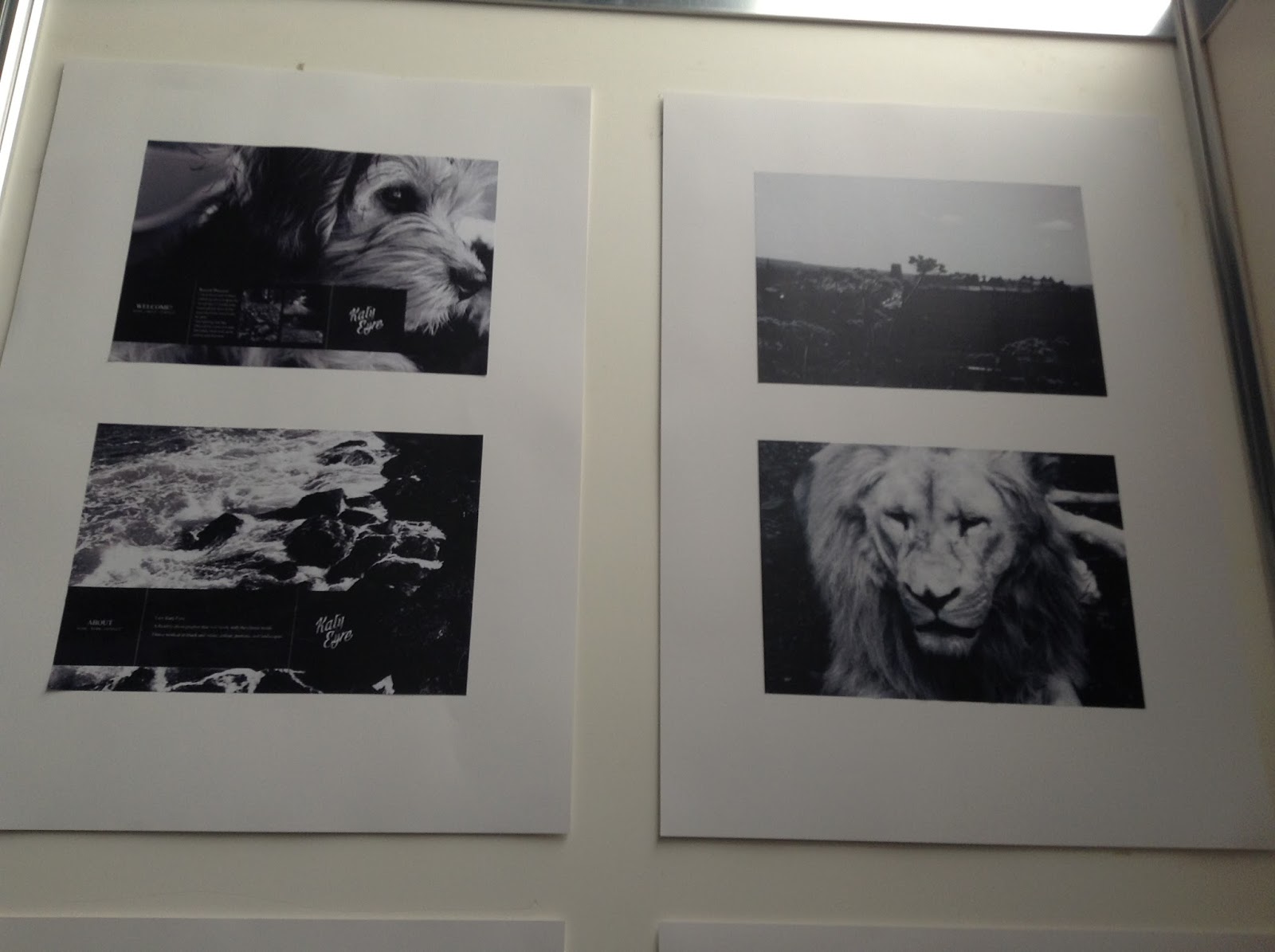
I really like this students work as it's a combination of photography and illustration work. On the top image; these are two are book covers designed for one of my favourite books. I feel that the illustrations reflect the storyline of the book and the theme very well. The colours, especially the yellow one, very well with the contents and story line of the book. Also, the illustrations of dexter himself fit perfectly to the actor who plays dexter in the TV series. The way she's drawn him highlights the key aspects of Dexters features that hint into his personality, for example: in the yellow one, he looks dark, evil and sinister, which is what he is on the inside and the colours she's used for him contrast well with the key colour of the book. The text also suits the work 'Dexter' and makes it look sharp and edgy with the serif font. One element of this that really caught my eye and gives an insight to the main features in the book was the drop of blood along the spine with the number of the book inside it. It's a very interesting way of showing the number of the book, and I feel that the red contrasts well with the colours of the books. 
On the second piece of work, I really like how the greyscale photos show off the features of the subjects, especially the lion. To get these levels of contrast, I think she must have used Adobe Photoshop and changed the image to greyscale, and then edited the curves and levels of the images. This makes them seem that bit more powerful and interesting as it highlights certain parts of the subjects in the images.


Joshua Peroti

Course: L3 Foundation Art & Design 


Personally, I've always had an interest in photography, whether it be landscapes, objects or portraits. Joshua's work instantly caught my eye as I walked past. This may be due to how it was laid out or it may be the colour effects used. On the top photo, the book which says 'look book' on it was a professionally made book featuring this students work, mainly portraits and side profiles of models. Each one of these photos had a good angle and had a good placement, such as in the middle or 3/4 up the photograph, and not randomly places which I found very professional. I also like the colour schemes used and the effects used which alter the colour balances of the photos. I will be able to take influence from Joshua's work, from the interesting positioning and sizes of the objects and the sizes the photos actually are/what they're on.


Jack Rattray

Course: BTEC L3 Ext Dip in Interactive Media Design


I find the top piece of Jack's work the most interesting. I really like how it's a new piece of design yet he's made it look distressed and old which is an effect I really like and would love to figure out how to incorporate in my own work. I also like how the composition works really well and that the colours go well together and don't clash. Another thing I like is how the boarder is bigger at the bottom, drawing our attention to it and leaving room for some text as well. However, I feel that the top boarder should have been the same width as the left and right sides of the boarder. I quite like the middle design as well. I really like the idea of forming a shape out of a thumbprint, as it can give a big insight as to what the book is about. I also like how colour was kept to a minimum, as it doesn't look too overcrowded and bright. However, I feel that the thumbprint could be a darker colour as it's hard to see the design from far away, like on the photo or example. I also like the contrast between the white text and the blue background, as the writing is easily legible. I feel that Jack's work has influenced me, as it has given me ideas that I would use in future projects. 

Tuesday, 25 June 2013

College Fashion Show 2013


Today I viewed our college's Fashion Show. The fashion show was a catwalk, modelling students work which they'd created based upon a chosen/negotiated or given brief. I feel that many of the students interpreted the briefs very well and in interesting/unique ways.
I was really impressed with the fashion show. The set up and choreography was all well planned and it was very entertaining to watch. 
All of the pieces of work looked very well made and some looked like they would be seen on professional catwalks, made by professional designers. They also looked like they could be featured in high end shops, although some did look a little bit too... unprofessional should I say. Personally, I've never been 'into' fashion or textiles, but this really did grab my interest. One thing they could have altered was the lighting, was it was extremely bright and the spinning lights kept glaring in my eyes, other than that, I would really like to see next years fashion show!

Tuesday, 21 May 2013

Sister Corita

Sister Corita
Sister Corita, who is also known as Corita Kent, was born names Frances Kent in Iowa, 1918. She lived in Los Angeles and grew up there until joining the Order of the Immaculate Heart of Mary in 1936, where she took the name of Sister Mary Corita. She studied at art Immaculate Heart College and graduated from there in 1941 and then went on to teach grade school in British Columbia. However, a few years later in 1946, Corita returned to Immaculate Heart College to teach art. Whilst she was teaching at the college she was also studying at the University of Southern California, where she received her master’s degree in art history. Coincidently, this was also the year that her first silkscreen print was exhibited. Many of Corita’s earlier works were very iconographic and were also known as ‘neo-gothic’ as they showed phrases and imagery from the Bible, linking in with her religion. She rose to global fame during the 1960s and the 1970s for her vibrant and eye-catching serigraphs. As Sister of the Immaculate Heart of Mary, she ran the Art Department right up until 1968, when she decided to leave the order and travel to Boston to continue her life there; where she would later create several commissioned pieces and serigraphs for the next eighteen years.  In Corita’s art, you can see reflections of her spirituality, her hope for there to be peace, her commitment to social justice and also her delight and wonder in the world that’s all around us. One of the main focus’ for her work in the 1960s was using pop-culture as a beginning for her work, which influenced the bursts of text and colour. Later on, she began to experiment more with watercolour, painting and also silk prints, which started to dominate her work. Whilst all this has been going on in her life, she still managed to stay active in social causes and designed many posters for billboards. Sadly, in 1986, she lost her battle with cancer and died at a friend’s home.
One common factor in Corita’s work, are the vibrant colours which stand out and the large hand-made texts. I’m quite interested in the backgrounds she uses, as they are the starting point when creating her work. I also like how negative space is used to show the type in some of her work. Another thing I like is how there isn’t a boarder and how it isn’t all contained, how some leaks off the page. I’m not usually a fan of vibrant coloured work, however, there’s something about her work which makes me think otherwise. I feel that the colour combinations go well too, there isn’t too much vibrant colour, yet there isn’t too little that it doesn’t catch your eye. I also like how you can tell the layering within her work, and how it must have been carefully thought out before, especially with the layering of colours and how they contrast with each other.

Sunday, 10 March 2013

Marian Bantjes


Marian Bantjes is a Canadian designer, typographer, writer and illustrator who is living and working on an island, just off the west coast of Canada, near Vancouver. She has no local clients, so all of her clients are from around the world, all thanks to the Internet. She mainly works for other designers or art directors, and also architects. Marian's graphic art crosses boundaries of style, time and technology. She is mainly known for her detailed and precise vector art, patterning and hand work; along with its organic and natural look. She often receives requests for her to create custom type for magazines, advertising and also some special projects; she has even worked with Stefan Sagmeister. 

'Fire' Wrapping paper
I really like this pattern, it reminds me of Art Nouveau with all of the swirls which represent fire. The colours however, remind me of aboriginal/tribal colours, which makes it intriguing. 

G2: Puzzle Special
I love work like this, where there's a hidden message in the pattern; I find it very eye-catching. This cover also matches the product which it's for as the cover is like a puzzle. I feel that the colours match and blend very well, which is key.

'Valentines 2011'
This is my favourite piece Marian has done. I love how the hearts are made up of interlocking and overlapping patterns. It makes them look full, but not over the top and yet again i feel that her colour choice was well co-ordinated and mixed.