Pages

Thursday, 10 January 2013

Art Deco


Art Deco was an art movement which began in the 1920s and lasted up until 1920. It all started in France with a group of French artists and designers at an event called Exposition Internationale des Arts Decoratifs et Industriels Moderns - the name Art Deco was later taken from that title.
This movement was very 'modern' at the time, and it celebrated the beauty of technology in the early 20th century. It mixed art with science and made references to trains, planes, cars and skyscrapers. Bold colours, rays, and other geometric heavy patterns were a trademark of Art Deco. Many human figures which are in Art Deco are often very stylized, like in this painting below:
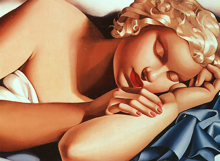
Tamara de Lempicka entitled Sleeping Woman.
This painting is very geometric, the head looks as though it's been carved out of a single sphere and her arms, neck and fingers all look like they've been carved from.
Although this movement ended in the 40s, Art Deco is still used today, often as an emelent in design which references positivity in the 1920s and 30s. 

The Art Deco style was influenced by several other art movements. Some which had a major influence on Art Deco were Cubism, Expressionism, Futurism and Vorticism. This has lead to Art Deco influencing many things such as architecture. Chicago is one of the most Art Deco-influenced cities in the world. Some of the most notable structures are:
LaSalle National Bank

The Chicago Board of Trade 

Adler Planetarium

Friday, 28 December 2012

Counterfeit Goods

Counterfeit goods are a big problem in Art & Design/Fashion. Counterfeiting goods is illegal but is still carried out all over the world. Counterfeit goods are fake items which people pretend are the 'real thing', selling them on to other people with them not knowing that they're a fake; these could be products such as clothes, shoes, perfumes, pirate DVDs and computer games, food products, alcohol, tobacco and even car parts. Pretty much anything can be copied and sold as a genuine. Today's technology makes it even easier for criminals to create sophisticated copies.


This (above) is an example of the difference between the real and fake products, many of the fakes are cheaper than the real products which my make unaware people want to purchase them due to the cheap price. Counterfeiting needs to be stopped, but it doesn't seem like any-time soon.

Thursday, 25 October 2012

Evan Hecox

Evan Hecox is based in Colorado. He's a designer and artist who's work portrays the life of  urban environments. His work has exhibited in places from Los Angeles, to London, and even Tokyo.


I find it interesting how he uses limited colour, as to me this has a big effect on the image. These colours remind me of hot places, which it seems to be where the image is based.
I find it very effective how he's used one block colour and used white as the lining, it gives it a very different but interesting effect. I don't usually like bold colours but I feel that Hecox has made this look very well. If you see deeper into this the image, the colour could symbolise the mood and feelings of the illustration. 
This images kind-of reminds me of a sahara desert with the deep 'warm' colours. The black also adds intensity and could symbolise darkness and nightfall, which os really interesting.

I find Evan's work simple, effecting and also purposeful. He may be an inspiration for me in the future.

Thursday, 18 October 2012

Chris Dent

Chris Dent

Chris Dent shows a hands on approach to work with his hand drawn work. His drawings are completely original and represent the world.  He has produced work for people such as Nike, PUMA, Xbox, AOL, New York Times and also Mazda. 


His work looks really fresh and reminds of of salad - simple, but good. In my opinion, his work is similar to a map.

This illustration is work he's done for PUMA. I love how he's made it from something which is map like and how it isn't just random lines. It's part of London stretched out to fit into the shape, which is the UK's capital and also where the 2012 Olympics was held, which relates to PUMA as they're both to do with sport. I think the monotone colour also gives a good look as I think it would look too much if there was colour added onto it.


I love the perspective from which this is drawn. It's almost as though you're in space, and the cities and the oceans are a lot bigger than you think. I find that it also shows how busy a city is and how distant the other towns can be. Its almost like the main city is so lively but the other towns are so quiet and empty. 
I feel that his work shows an out of the box view on modern life which is very appealing to me.


I find it rather intriguing how he's highlighted a heart in the city with colour, it makes it stand out so well. It could be showing that that part is the heart and the life of the city. This looks very effective and definitely makes it stand out.

Tommy Penton

Tommy Penton

Tommy is a freelance illustrator and a graphic designer, who mainly creates posters and CD artworks. He has also worked on nationwide advertising campaigns as-well as other advertising work for bands such as British Airways, Virgin, Fabric and Edinburgh Film Festival.


^ This picture is probably my favourite of his work, as it looks simple and like it's from an instruction manual - he could have added in the detail from the windows and shown the movement of the train be he decided to keep with the clarity and purity of everything else.

I really like he takes in his surroundings and changes them to his perspective whilst drawing them. I also like how he uses bold lines to show the majority of the outlines where as he uses faint lines for patterns and minor details. 


I don't really like this image as I think that the bold colour ruins the purity and cleanliness of the image. Also, I think the bold colour doesn't suit this kind of illustration. 
But there is one thing I like about this - I find it unique and interesting how the perspective and the angle it is drawn from a 'fish eye view', which makes some parts of it bigger than others, showing the pain parts of an image.


I prefer this image with colour in comparison to the one above, as the colours fit in with the style of the drawing and doesn't ruin the image. I love how the colours are nearly co-ordinated too - they bend really well and draw you into the image. I find these images really interesting as it's basically an insight into Tommy's mind and how he sees the world around him.

Oliver Kugler

Oliver Kugler

Oliver was born in 1970 in Germany, he currently works as an illustrator in London, producing work for clients all around the world. He loves to draw people he meets and the places he visits upon his travels.

He mainly does work for newspapers and magazines such as The Guardian, The New York Times, and also New York Magazine.

His work appears very simple when it's just a line drawing, but it turns into something so complex once colour is added.

I find it very interesting how on some images, he can make it seem so full and busy with just some lines of the views he sees.
His work reminds me of a simple, easy life and a basic perception of the world. 


I really like how the colours that he uses are really simple, basic and pale/non vibrant colours which helps the image look simple and not cluttered. I also love how he doesn't use many colours which stops the image from looking 'too much'.
I find his illustrations interesting as he draws them whilst he's travelling, which means they must be rough drawings which shows his perspective on daily life. They also show how busy yet so calm daily life can be.


Monday, 1 October 2012

Gary St. Clare


Gary St Clare was born and raised in New York, Manhattan. He is currently a digital artist who started his formal art training at LaGuardia High School of the Arts in New York City with a concentration in Art & Music. He majored in Graphics Design where he combined graphics, photography and typography.


In his career he works with many different companies such as Verve Jazz and V2 records where he produced a huge range of record sleeves, Cd's and posters for major artists like Moby, Black Crows, and White Stripes etc.
St. Clare has had a lot of experience in the commercial world, which has enabled him to produce work that represents other people’s vision. His work presents his personal views on life, which people all over the world can relate to. 


 I find it very interesting how St. Clare combines photography with graphic design and typography. The way he uses graphic design to make the images stand out and how they blend so well – it almost looks naturally like that. His choice of colour isn’t too vibrant and the colours blend/go well together which, which has a massive effect to the minimal colour on the images. He uses transparency of the graphic parts to bring through the background, which has a very interesting effect with the overlays. His work will most definitely inspire me in my future work.